
Interesting Details about ROC Curve Calculations
The area under the receiver operating characteristic curve (commonly known as “AUC” or “AUROC”) is a widely used metric for evaluating binary classifiers. Most data scientists are familiar with the famous curve itself, which plots the true positive rate against the false positive rate, and are familiar with integrals (i.e., area under the curve). So, it’s a pretty straightforward concept theoretically, but how is it actually calculated for a real dataset and a real model? That is what we’ll be digging into in this post. There’s some interesting intuition to be gained by understanding the exact implementation (which is quite simple).
Quick disclaimer here: It is not the intent of this post to show how these calculations are implemented in production; there are variations and optimizations to the methodology and code presented. Rather, the intent is to show a basic, easy to understand implementation with the objective of building the reader’s intuition.
General Discussion
Before jumping into the code, let’s take a stroll down conversation street and provide a general, high-level, and undoubtedly hand-wavy treatment of the famed ROC curve. Receiver Operator Characteristic. The origin of the name (and the method) traces its roots back to World War II. Radar operators (or receivers) sat in front of a display and were tasked with sounding an alarm whenever an enemy aircraft was detected. Of course, radar signals can be quite noisy and it was difficult to distinguish between an enemy bomber and something far less menacing, such as a flock of geese. So, in effect, these radar operators were functioning as binary classifiers. There was a dire need to identify as many enemy aircraft as possible (recall, true positive rate), while minimizing the number of times the base went into high alert over an innocent flock of geese (false positive rate). Thus, the ROC curve was introduced as a method to analyze the performance of radar operators.
The idealized ROC curve is continuous across all possible classification thresholds. Points that are plotted on the ROC curve correspond to particular classification thresholds \(T \in (-\infty, \infty)\). In the real world we are dealing with a discrete number of data points with which we would like to estimate the ROC curve for a classifier of interest. This manifests itself in ROC curves that can look a bit jumpy rather than smooth. Instead of considering all possible thresholds, we only have \(N\) thresholds to consider, where \(N\) is the number of data points in the dataset we are evaluating.
The way I like to think about calculating ROC and AUC is to consider a simple table with columns for \(Y\) and \(\hat{Y}\), sorted descending by \(\hat{Y}\). You then iterate over rows of this table and the threshold you consider at any given moment is wherever the cursor of your iterator is. There is no need to quantify this threshold (e.g., \(T=0.75\)), it is simply something that classifies all data points above it as the positive class and all data points below it as the negative class. From here it is easy to calculate and record the FPR and TPR for this threshold. This (FPR, TPR) pair will then become a data point plotted on the ROC curve. When you are finished iterating over your data points, you have \(N\) (FPR, TPR) data points which are plotted to form the full ROC curve. This exact algorithm is implemented in code later in this post.
The only thing that matters in calculating the ROC curve and its AUC is the rank ordering of the predictions. Typically, normalized model outputs \(p \in [0, 1]\) are used for this, but as I will show in this post, unnormalized model outputs, such as outputs from a linear layer before sigmoid application, \(s \in (-\infty, \infty)\) are equally valid.
A common mistake to be avoided at all costs is calculating AUC using binarized predictions, e.g., \(\hat{Y} \in \{0, 1\}\) instead of scores or probabilities \(\hat{Y} \in (-\infty, \infty)\). The scary thing about this mistake is that most implementations like scikit-learn’s roc_auc_score will not throw an error. The computation can still be performed, but the critical sorting step doesn’t make sense anymore and the result will be something… strange.
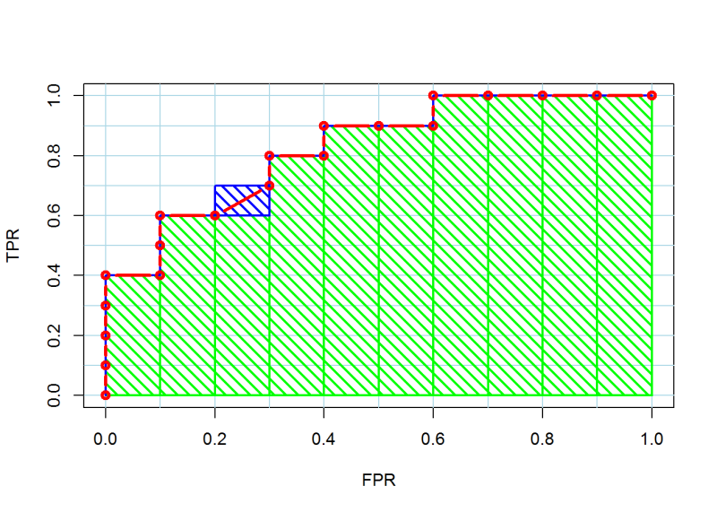
Many references will describe the computation of the area under the ROC curve using an integral and leave it at that. An integral may be a technically correct description, but it doesn’t give the reader any intuition about how this area calculation is actually performed. It’s actually quite simple. Once you understand the algorithm described above, you can see that the ROC curve itself is really just a bunch of right angles. Thus, the area under the curve can be calculated as the sum of the area of several rectangles.
Tutorial
In this section we will illustrate the concepts discussed above with a Python implementation.
Imports…
import numpy as np
import pandas as pd
import matplotlib.pyplot as plt
import torch
import torch.nn as nn
from torch.utils.data import Dataset, DataLoader
from fastprogress import master_bar, progress_bar
from sklearn.model_selection import train_test_split
from sklearn.metrics import roc_auc_score, roc_curve, auc
Generate Synthetic Dataset
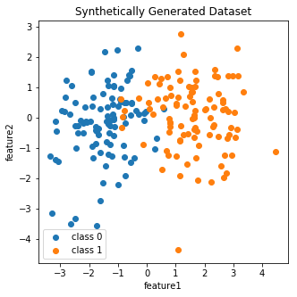
To keep things on the data front simple, I generate 100 data points each from two 2-dimensional Gaussians. Care is taken to ensure the classes are not linearly separable.
x0 = np.random.multivariate_normal([-1.5,0], [[1,0],[0,1]], 100)
x1 = np.random.multivariate_normal([1.5,0], [[1,0],[0,1]], 100)
fig, ax = plt.subplots(figsize=(5,5))
ax.scatter(x0[:,0],x0[:,1], label='class 0')
ax.scatter(x1[:,0],x1[:,1], label='class 1')
ax.legend()
ax.set_title('Synthetically Generated Dataset')
ax.set_xlabel('feature1'); ax.set_ylabel('feature2')
plt.show()
X = pd.DataFrame(np.concatenate([x0,x1]), columns=['feature1','feature2'])
y = np.array([0]*100 + [1]*100)
X.shape, y.shape
# ((200, 2), (200,))
Train/test split.
X_train, X_valid, y_train, y_valid = train_test_split(X, y, test_size=50, random_state=199)
Pytorch Data and Model
I define a Pytorch implementation of logistic regression to model the data.
class SimpleDataset(Dataset):
    def __init__(self, X, y):
        self.X = torch.from_numpy(X.values).type(torch.FloatTensor)
        self.y = torch.from_numpy(y).type(torch.FloatTensor).reshape(-1,1)

    def __len__(self):
        return len(self.X)

    def __getitem__(self, index):
        return self.X[index], self.y[index]
# instantiate datasets and dataloaders for train and valid data
train_ds = SimpleDataset(X_train, y_train)
valid_ds = SimpleDataset(X_valid, y_valid)
train_dl = DataLoader(train_ds, batch_size=150)
valid_dl = DataLoader(valid_ds, batch_size=50)
class LogisticRegression(nn.Module):
    def __init__(self, p):
        super().__init__()
        # single linear layer. non-linearity is handled
        # by the loss function
        self.lin = nn.Linear(p, 1)

    def forward(self, x):
        x = self.lin(x)
        return x
Train Model
The model is trained on a CPU for 100 epochs at a fairly low learning rate for this data.
model = LogisticRegression(train_ds.X.shape[1])
num_epochs = 100
lr = 3e-2
optim = torch.optim.Adam(model.parameters(), lr=lr)
criterion = nn.BCEWithLogitsLoss()
final_actn = torch.nn.Sigmoid()
model.train()
train_losses = []
valid_losses = []
mb = master_bar(range(num_epochs))
for _ in mb:
    pb = progress_bar(train_dl, parent=mb)
    train_batch_losses = []
    for X, y in pb:
        optim.zero_grad()
        out = model(X)
        loss = criterion(out, y)
        loss.backward()
        optim.step()
        train_batch_losses.append(loss.item())
    train_losses.append(np.array(train_batch_losses).mean())

    model.eval()
    valid_batch_losses = []
    for X_val, y_val in valid_dl:
        out = model(X_val)
        val_loss = criterion(out, y_val).item()
        valid_batch_losses.append(val_loss)
    valid_losses.append(np.array(valid_batch_losses).mean())
Total time: 00:00 <p>
fig, ax = plt.subplots()
x = range(len(train_losses))
ax.plot(x, train_losses, label='train')
ax.plot(x, valid_losses, label='valid')
ax.set_title('Training and Validation Losses')
ax.set_xlabel('epoch')
ax.set_ylabel('loss')
ax.legend()
plt.show()
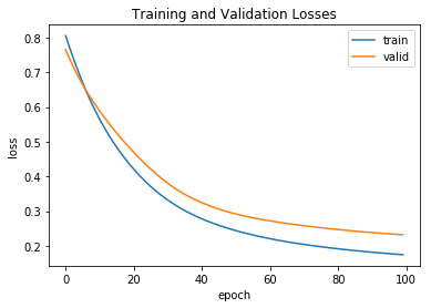
As seen in the plot above, the model was still improving when training was stopped and beginning to slightly overfit.
Calculate AUC using Scikit-Learn Function
Score the validation set using the trained model:
valid_scores = []
model.eval()
for X_val, y_val in valid_dl:
    out = model(X_val)
    out = out.reshape(-1).tolist()
    valid_scores.extend(out)
As you can see, since the model was not defined with a sigmoid output layer, the raw model outputs are unnormalized scores being emitted from the single linear layer.
valid_scores = torch.Tensor(valid_scores)
valid_scores
tensor([ 1.3256, -3.9111,  0.9515,  3.7141, -3.9993, -3.3840, -1.6937, -1.7872,
         5.4634, -2.6962,  0.3090, -3.8332,  2.0432, -0.4319, -1.3281, -1.3519,
         1.3732,  2.6428,  0.5165, -0.6518,  1.5274,  4.4482, -1.7946, -1.2051,
        -0.7633,  2.7398, -2.3134,  2.7641,  4.1584, -0.0191, -2.0982,  2.8374,
        -1.0771, -2.8697,  2.5235, -2.8222,  4.1701, -0.9285,  4.1537, -2.7113,
         2.5709, -3.7759,  3.6061,  1.5652, -1.8460,  1.0918, -0.2882,  3.0891,
         5.1594, -2.1279])
These unnormalized scores are mapped into probabilities using the sigmoid function:
valid_probas = final_actn(valid_scores)
valid_probas
tensor([0.7901, 0.0196, 0.7214, 0.9762, 0.0180, 0.0328, 0.1553, 0.1434, 0.9958,
        0.0632, 0.5766, 0.0212, 0.8853, 0.3937, 0.2095, 0.2056, 0.7979, 0.9336,
        0.6263, 0.3426, 0.8216, 0.9884, 0.1425, 0.2306, 0.3179, 0.9393, 0.0900,
        0.9407, 0.9846, 0.4952, 0.1093, 0.9447, 0.2541, 0.0537, 0.9258, 0.0561,
        0.9848, 0.2832, 0.9845, 0.0623, 0.9290, 0.0224, 0.9736, 0.8271, 0.1363,
        0.7487, 0.4284, 0.9564, 0.9943, 0.1064])
valid_scores = valid_scores.numpy()
valid_probas = valid_probas.numpy()
Calculate the AUC using the normalized model outputs \(\hat{Y} \in [0, 1]\), as is typically done:
roc_auc_score(y_valid, valid_probas)
# 0.9759615384615384
In contrast, calculate the AUC using the unnormalized outputs \(\hat{Y} \in (-\infty, \infty)\). Notice that the AUC is exactly the same.
roc_auc_score(y_valid, valid_scores)
# 0.9759615384615384
Manually Construct ROC Curve and AUC Calculation
To begin our manual calculation, let’s toss the model probabilities and true values into a dataframe:
auc_data = pd.DataFrame({'probas':valid_probas, 'y_true':y_valid})
auc_data.head()
| probas | y_true | |
|---|---|---|
| 0 | 0.790115 | 1 |
| 1 | 0.019625 | 0 |
| 2 | 0.721424 | 1 |
| 3 | 0.976202 | 1 |
| 4 | 0.017999 | 0 |
Sort the data by the model probabilities:
auc_data.sort_values(by='probas', ascending=False, inplace=True)
auc_data = auc_data.reset_index(drop=True)
auc_data.head()
| probas | y_true | |
|---|---|---|
| 0 | 0.995779 | 1 |
| 1 | 0.994287 | 1 |
| 2 | 0.988435 | 1 |
| 3 | 0.984784 | 1 |
| 4 | 0.984608 | 1 |
Create a simple “rank” column:
auc_data['rank'] = range(1,len(auc_data)+1)
auc_data.head()
| probas | y_true | rank | |
|---|---|---|---|
| 0 | 0.995779 | 1 | 1 |
| 1 | 0.994287 | 1 | 2 |
| 2 | 0.988435 | 1 | 3 |
| 3 | 0.984784 | 1 | 4 |
| 4 | 0.984608 | 1 | 5 |
Delete the model probabilities data in order to illustrate the point that they aren’t needed for ROC or AUC calculations (after they’ve been used to rank order):
auc_data.drop(columns=['probas'], inplace=True)
auc_data.head()
| y_true | rank | |
|---|---|---|
| 0 | 1 | 1 |
| 1 | 1 | 2 |
| 2 | 1 | 3 |
| 3 | 1 | 4 |
| 4 | 1 | 5 |
Precompute a cumulative sum of the true values. This will come in handy later when we’re performing the calculations.
auc_data['y_true_cumsum'] = auc_data['y_true'].cumsum()
auc_data.head()
| y_true | rank | y_true_cumsum | |
|---|---|---|---|
| 0 | 1 | 1 | 1 |
| 1 | 1 | 2 | 2 |
| 2 | 1 | 3 | 3 |
| 3 | 1 | 4 | 4 |
| 4 | 1 | 5 | 5 |
Now it’s time for the real computation. As discussed previously, we are going to iterate over the sorted predictions, consider the cursor as a threshold, and compute statistics for each iteration.
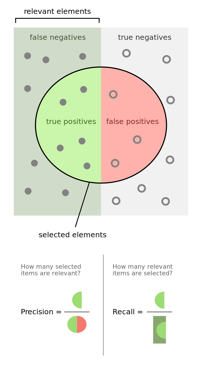
As a refresher, recall that the ROC curve plots True Positive Rate (TPR) vs. False Positive Rate (FPR).
- True Positive Rate (TPR), Recall, “Probability of Detection”
- False Positive Rate (FPR), “Probability of False Alarm”
Precompute the number of data points in the positive and negative classes:
n_pos = (auc_data['y_true']==1).sum()
n_neg = (auc_data['y_true']==0).sum()
This is the tricky bit. I did what I could to explain each step in the code comments:
tpr = [0]; fpr = [0]; area = []

# iterate over data points, ie, **thresholds**
for _,row in auc_data.iterrows():

    # the "rank" column conveniently proxies for the number of
    # data points being predicted as the positive class
    num_pred_p = row['rank']

    # the cumulative sum of y_true equals the the number of
    # true positives at this threshold
    num_tp = row['y_true_cumsum']

    # the number of false positives is then the difference
    # between the total number of predicted positives
    # and the number of true positives
    num_fp = num_pred_p - num_tp

    # compute TPR and FPR at this threshold and store it
    tpr_tmp = num_tp / n_pos
    fpr_tmp = num_fp / n_neg
    tpr.append(tpr_tmp); fpr.append(fpr_tmp)

    # compute the area of the little rectangle at this threshold
    delta_fpr = (fpr[-1] - fpr[-2])
    area_tmp = tpr[-1] * delta_fpr
    area.append(area_tmp)
Using our hand-calculated values, let’s plot the ROC curve and compute the AUC:
fig, ax = plt.subplots()
ax.plot(fpr, tpr)
ax.set_title('ROC Curve | Manual Calculation')
ax.set_xlabel('FPR'); ax.set_ylabel('TPR')
plt.show()
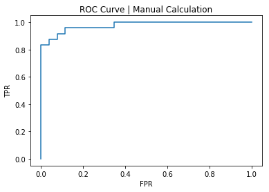
AUC, manual calculation:
np.array(area).sum()
# 0.9759615384615383
To check our work, let’s plot the ROC curve and compute the AUC using scikit-learn:
fpr_skl, tpr_skl, _ = roc_curve(y_valid, valid_probas)
fig, ax = plt.subplots()
ax.plot(fpr_skl, tpr_skl)
ax.set_title('ROC Curve | Scikit-learn Calculation')
ax.set_xlabel('FPR'); ax.set_ylabel('TPR')
plt.show()
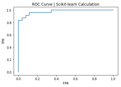
AUC, scikit-learn calculation:
auc(fpr_skl, tpr_skl)
# 0.9759615384615384
Whew! It checks out.
Conclusion
In this post we covered the intuition behind ROC/AUC calculations, and warned against some common mistakes. We also proved the calculations can be performed using unnormalized model scores, and performed hand-calculations for a custom Pytorch logistic regression model trained on synthetic data and verified the results against scikit-learn results.
The notebook associated with the code in this post can be found here.